


The Goal
Shanghai American School had a bi-weekly magazine called ‘Eagle’ that had been around for many years, but it had a couple of problems. The main problem was that most people didn’t read it. In order to change that, they wanted to change it to a thicker, more high-end magazine with more in-depth articles and only four issues per school year. More quality, less quantity. To achieve that, they wanted to completely change the design so that it reflected these changes.


Old to new
The Process
Finding the right style
Once we had the vision of the new magazine, it was time to start working on making it real. We wanted a strong, striking image on the cover and initially had designs with isolated subjects on a single background color, as you can see in the first image below. There were also different font treatments, both for the logo and cover headlines/text in the early stages.
Although we really liked the white frame around the photo on the cover, we also tried other layouts for the cover (see image 2 below). In the end, we decided to go with the white frame, since the other designs would only work with a certain type of image and we didn’t want to be limited in that way. We also decided to not have isolated subjects on a single color background for the cover, again to not be limited when it comes to cover photos.
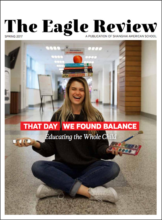
In the third image below, you can see what the cover design looked like for the original Eagle magazine (not done by us), then the redesigned cover for the Eagle magazine, and finally the finished Eagle Review cover design for the first issue.


“The feedback after the launch was extremely positive.”
The Result
Higher quality paper, elegant design and increased readership
The reception of the new Eagle Review was very positive, both from faculty/staff and students/parents. More people were reading it and were willing to contribute photos and articles, all thanks to the new design and new content. The magazine felt like a perfect fit for the Shanghai American School and matched the high standards of the education there.
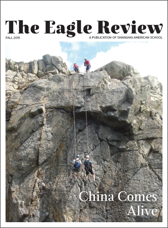
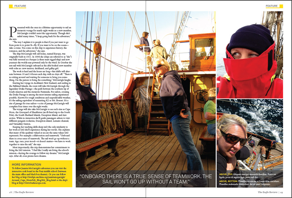
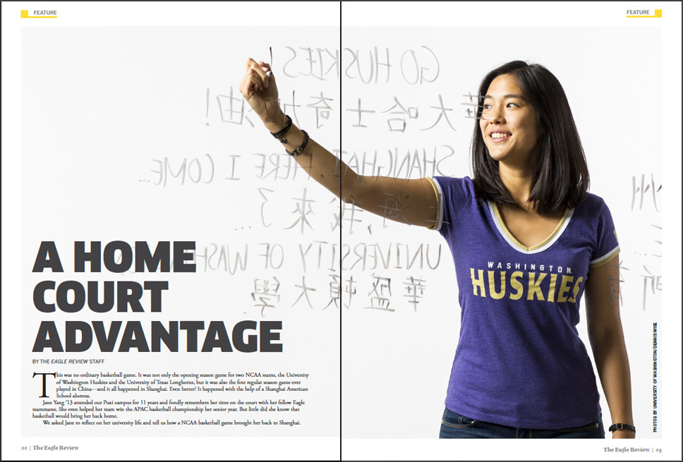
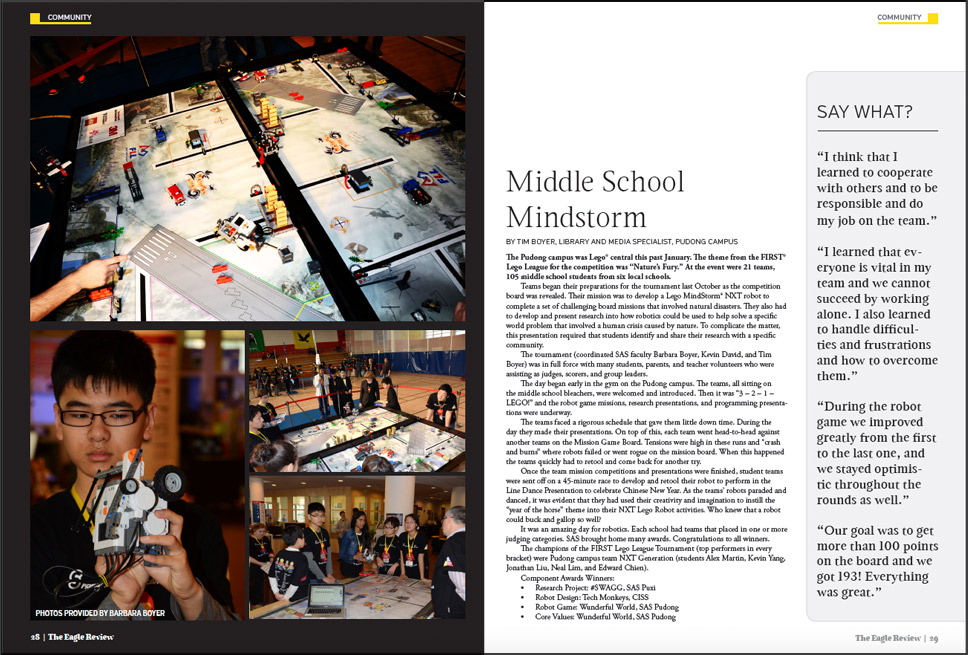
Below are some covers and spreads from the different issues of the Eagle Review.


“We achieved everything we wanted to achieve, and then some.”
Details
Additional info
The Eagle Review is still using the same design. However, as part of the new ad campaign that Shanghai American School launched in the fall of 2016, I revised the cover slightly to match the design of the ads. Below you can see examples of the new cover design.
In 2017, due to the school’s rebranding, there were additional changes made.

client
Shanghai American School
project type
Magazine design
date
Fall 2013