


The Goal
Shanghai American School is different from many other schools. From the location to the many opportunities that the students have, both on the campus and away. However, the school’s ads did not show how different the school is. Neither the design nor the message of the ads showed the uniqueness of the school. The ads looked different from ad to ad and there was also no consistency in the message. That’s was the problem that the new ads had to solve.


Old to new
The Evolution
Finding a new style and developing it further
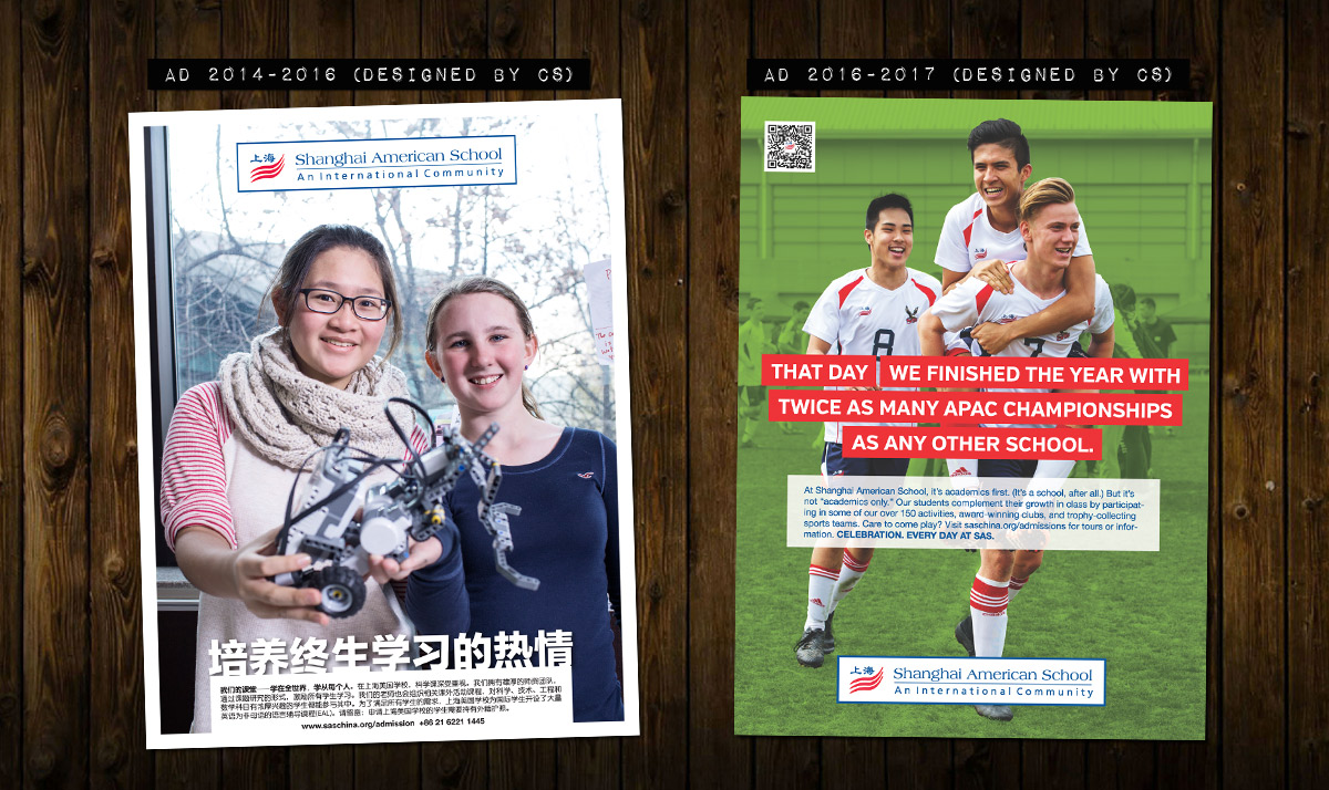
The old ads had many problems; they had different messages for each ad, too much text, not enough focus and each ad had a different style. In short, they weren’t consistent and the message wasn’t strong enough.
We started with the message. Shanghai American School wanted to show their achievements and wide range of activities. We decided to focus on academics, sports and arts. Three messages were developed: Lifelong Learning, Winning Mentality and Passion for Arts. We also decided that the accompanying text would be short and focused, with a call to action.
The look of the ads was designed to enhance the new and consistent messages that were being developed. The ads would have a big and powerful photo, with one of the three messages in bold text, followed by the accompanying text in white box. They would also have a white border around them, similar to the new look of their magazine Eagle Review, which I had recently re-designed. So the end result was a strong, new design that also was consistent with their other publications. A unified look.
In 2016, Shanghai American School decided to change the message and the style of the ads. The new concept was called “That day” and they wanted to highlight all the different extraordinary things that happen at the school, almost at a daily basis. They wanted to use big photos again, but not be as limited when it came to finding photos that could be used. The previous ads really needed strong images in order to be effective. Together we decided that a good way to do that, would be to highlight the subject of the photo/ad by isolating it and keeping it in full color, while the rest of the photo had a color tone. They also wanted to be able to have a longer message, so a new treatment of the message was designed too.
Below are some examples of the old ads, the ads that were used 2014-2016 and the new ads from 2016/2017.


“Every day at SAS, something extraordinary happens.”
The Result
Consistent message and style
Below are some additional examples of the ads used 2014-2016. Each year, in time for graduation, ads were designed that looked slightly different, since they needed to have longer texts, and they also did not want to use photos of graduating students on them. All the other ads used “Lifelong Learning”, “Winning Mentality” and “Passion for Arts.” Towards the end of the 2015/16 school year, they started to use other messages and have more information on them and there is also an example of that below (“Building Educational Excellence”). It was clear that a new style was needed and that was designed at the start of the next school year.


In the fall of 2016, the new design was ready to be rolled out. The new concept “That day” was used to show the things that normally does not happen in a school, but happens almost every day at SAS. Several different colors were used to background and there were also different format (full page, half page and 1/3 page).


“The design is a perfect match for the concept.”
Details
Additional info
For the 2017/18 school year, Shanghai American School changed their logo and re-branded their whole identity, so the ads are no longer used.
client
Shanghai American School
project type
Advertisements
date
2014-2017